

Odoo mobile app development is useful only when it fits how people actually work outside the office. At Cyngro, we build mobile apps that focus on speed, clarity, and real tasks, so teams can update data, check information, and move work forward without depending on laptops or complex screens.
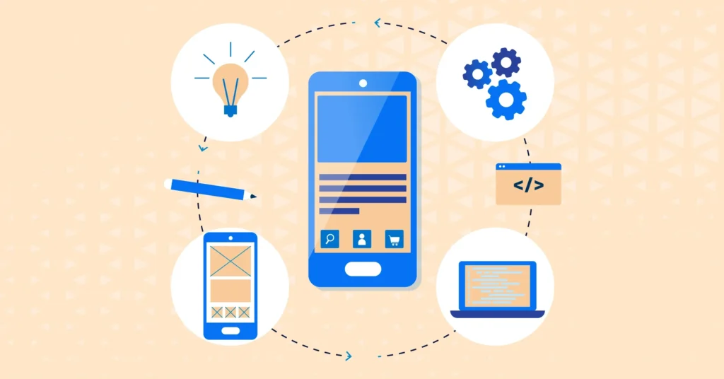






Some Odoo workflows simply don’t translate well to mobile screens. Instead of forcing everything into an app, we focus on what users actually need while on the move. Each custom mobile app is built around a small set of actions. That keeps screens light, interactions clear, and daily usage practical rather than overwhelming.
Field teams usually care about speed and reliability more than features. Mobile apps here are designed to capture updates quickly and sync them without fuss. Connectivity issues are common, so the apps are prepared for that reality. Work doesn’t stop just because the signal drops for a while.
Sales teams don’t want full ERP views on a phone. They want quick access to customer details, orders, and notes while conversations are still fresh. Mobile tools are shaped around that pace. Information gets recorded when it matters, not later when details are forgotten.
Warehouse environments demand focus. Mobile apps here stay simple by design. Clear confirmations, minimal input, and readable screens help staff move faster without second-guessing actions. This reduces small errors that usually happen during busy shifts and keeps records aligned with real movement.
Not every location has a stable internet. Mobile apps are built to keep working even when connectivity is inconsistent. Tasks can be completed as usual, and data syncs later. This prevents lost work and avoids frustration for teams that move between sites or work in remote areas.
Once an app is used daily, small issues surface naturally. A screen feels slow. A step feels unnecessary. We treat this as normal evolution, not failure. Ongoing support focuses on keeping the app useful as workflows change, without constantly rebuilding or overcomplicating it.

A service team needed quick access to job updates while working off-site. Desktop access wasn’t practical, and notes were often added hours later. Cyngro introduced a focused Odoo mobile app to log updates, check task details, and sync data later. The result wasn’t flashy, but work became more consistent and information stayed accurate without extra effort.

Most mobile apps are designed while sitting at a desk, not while standing on a site or moving between tasks. We begin by understanding where the app will actually be used. Whether users are walking, multitasking, or working under time pressure, those conditions shape every design decision.
By focusing on real usage instead of assumptions, mobile apps feel practical rather than impressive. Screens stay short, actions stay clear, and users don’t need to stop and think. The app supports work quietly in the background instead of demanding constant attention or adjustment.
Desktop workflows rarely translate well to phones. We avoid shrinking full ERP screens and calling them mobile-ready. Instead, flows are rebuilt specifically for smaller screens and shorter interactions. Only what matters in that moment is shown.
This approach removes clutter and reduces friction. Users complete tasks faster and with fewer mistakes. Over time, adoption improves because the app feels natural to use, not like a compromised version of a larger system.
Mobile work doesn’t happen in ideal environments. Internet drops, devices differ, and distractions are common. We design apps knowing these issues will happen, not hoping they won’t.
Offline handling, simple interactions, and forgiving flows help users continue working even when conditions are unstable. When connectivity returns, data syncs quietly. This reliability builds trust in the app and prevents frustration during everyday use.
Mobile apps suffer when too many features are added early. We question every feature before building it. If it doesn’t clearly support daily work, it waits.
This restraint keeps apps fast and easier to maintain. As real usage grows, features can be added thoughtfully instead of rebuilding everything. The result is a mobile app that stays useful rather than becoming heavy over time.
The most valuable feedback appears after launch, not before. Once users rely on the app daily, they notice what slows them down or feels unnecessary. We treat this feedback as part of the process.
Small, regular refinements help the app settle into real workflows. Over time, it becomes a dependable tool shaped by actual use, not assumptions made during early planning.
Designed for real interaction
Good mobile experiences start with understanding how people actually interact with screens. We design interfaces by watching real usage patterns, not by following trends. Layouts stay simple so users don’t pause to think before acting.
Focused on clarity, not decoration
Visual design here serves one purpose: clarity. Buttons are placed where users expect them. Information is spaced for quick scanning. This reduces mistakes and helps users feel comfortable using the app without relying on instructions.
Purpose-driven applications
Not every business need fits neatly inside an ERP or mobile app. We build supporting applications that solve specific problems without creating parallel systems. Each app has a clear role and avoids unnecessary complexity.
Built to adapt over time
Applications are structured so changes don’t require rebuilding everything. As workflows evolve, features can be adjusted gradually. This keeps applications useful without disrupting systems teams already depend on.
Aligned with daily operations
We build software around how teams already work instead of forcing new habits. Time is spent understanding processes before proposing solutions. This keeps adoption smooth and reduces resistance during rollout.
Maintainable by design
Code is written clearly and documented properly. This makes future updates easier and avoids long-term dependency on a single developer. Systems remain understandable and flexible as business needs change.
Clear structure and messaging
Websites are organized so visitors quickly understand what matters. Content flows logically, and navigation stays intuitive. This helps users find information without frustration and encourages meaningful interaction.
Reliable performance across devices
Speed, stability, and responsiveness are treated as essentials. Websites load consistently, work across screen sizes, and remain easy to update. The focus stays on dependability rather than visual noise.

Mobile apps usually struggle because they are imagined in ideal conditions. Real work is different. People are moving, distracted, or short on time. We start by understanding those situations first, not by listing features. How someone actually uses their phone during work matters more than what looks good on a screen. When apps are shaped this way, they feel easier to use. People don’t need to stop and think. Actions feel obvious. The app becomes part of the routine instead of something users have to consciously deal with during a busy day.
Trying to fit too much into a mobile app almost always causes problems later. We slow things down at this stage and question what really needs to be there. If a feature doesn’t help someone complete a task faster, it usually doesn’t belong on mobile. Keeping apps focused makes daily use simpler. It also reduces maintenance issues over time. Fewer features mean fewer edge cases, fewer bugs, and less frustration when updates or changes are needed.
Mobile apps don’t settle immediately after launch. Once people start using them regularly, small issues surface. Something feels unnecessary. Something else needs to be quicker. We expect that phase instead of treating it as a failure. By allowing the app to evolve slowly, changes stay manageable. The app improves alongside real usage rather than needing large redesigns later. This keeps it useful without disrupting work.

We begin by understanding where the mobile app will actually be used. On-site, in warehouses, during travel, or between meetings. These conditions shape decisions early. Designing around real situations prevents apps that look fine in testing but fail once daily work begins.
Mobile apps work best when they stay focused. We identify the few actions users truly need on their phones and build around those. Anything that slows interaction or adds confusion is left out. This keeps the app lightweight, usable, and easier to maintain.
Real feedback appears only after people start using the app regularly. We treat this phase as part of the process. Small refinements are made based on usage patterns so the app settles naturally into workflows instead of forcing constant adjustment.
Most teams don’t need a full ERP on their phone. They need quick access to a few actions while moving. Updating a record, checking a status, or logging something before it’s forgotten. A good Odoo mobile app focuses on those moments, not on copying desktop behavior.
Web access works fine in the office. Mobile apps become useful when work happens outside it. Field visits, warehouses, sales calls, or on-site tasks often need faster interaction. In those cases, a mobile app removes delays and reduces the habit of “doing it later.”
Yes, and that’s usually the better approach. A mobile app can be designed for one role or one task instead of everyone. This keeps screens simple and avoids confusion. Not every user needs the same information on a phone.
This is common in real work environments. Mobile apps can be designed to keep functioning when connectivity drops. Users continue working, and data syncs later. This prevents lost updates and avoids frustration caused by unreliable networks.
Very different. Mobile screens allow less space and less attention. That means fewer options, clearer actions, and shorter flows. Trying to shrink desktop screens usually leads to poor usability. Mobile-first design changes how features are selected and presented.
It depends on scope, not on technology alone. Focused apps can be built relatively quickly. Broader apps take more time. Most teams benefit from starting small, using the app, and then improving it based on real usage.
Almost always. Once people use the app daily, they notice what feels slow or unnecessary. This isn’t a problem. It’s normal. Mobile apps improve through small adjustments rather than big redesigns.
The simplest indicator is where delays happen today. If updates are postponed, notes are written elsewhere, or information is re-entered later, a mobile app usually helps. The goal isn’t more features, but fewer workarounds.